The science of the new AZERTY
Every step in this standardization process was focused on keyboard users, but it is difficult to decide what constitutes a good layout : should we favor speed and ergonomics, or make the characters easy to find? Should it favor "formal" text input, or everyday speech? How useful should it be to IT engineers, or to social media users? Juggling all these criteria and constraints is very difficult if you do it by hand.
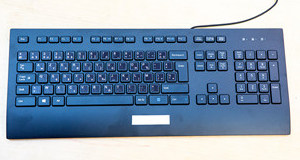
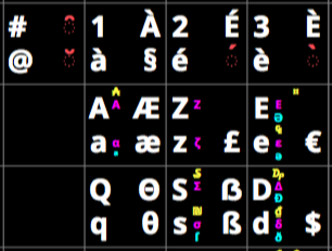
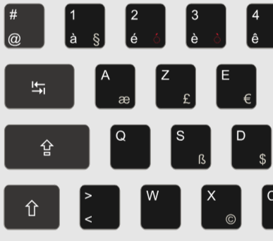
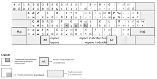
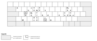
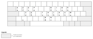
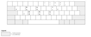
The design of the new AZERTY layout was therefore supported by advanced algorithmic methods. We developed an optimization process that was used by the experts of the AFNOR standardization committee to design a keyboard layout that can be useful for everyone. The resulting layout is illustrated above. Clicking on a character brings up elements of the rationale behind its position, which takes into account the quantitative and qualitative criteria that presided over the design of the new AZERTY layout.
You can learn more about the methods and algorithms we used to develop the new AZERTY layout in our research articles :




Research articles on the new AZERTY layout

Anna Maria Feit, Mathieu Nancel, Maximilian John, Andreas Karrenbauer, Daryl Weir, Antti Oulasvirta
AZERTY amélioré: Computational Design on a National Scale

Anna Maria Feit, Mathieu Nancel, Daryl Weir, Gilles Bailly, Maximilian John, Andreas Karrenbauer, Antti Oulasvirta
Élaboration de la disposition AZERTY modernisée


Maximilian John and Andreas Karrenbauer
Dynamic Sparsification for Quadratic Assignment Problems
Our research on keyboards layouts and text entry
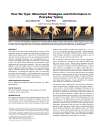
Anna Maria Feit, Daryl Weir, Antti Oulasvirta
How We Type: Movement Strategies and Performance in Everyday Typing.

Vivek Dhakal, Anna Maria Feit, Per Ola Kristensson, Antti Oulasvirta
Observations on Typing from 136 Million Keystrokes
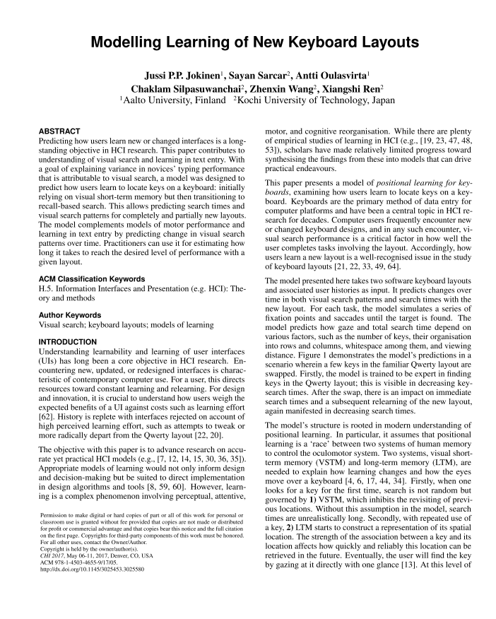
Jussi Jokinen, Sayan Sarcar, Antti Oulasvirta et al.
Modelling Learning of New Keyboard Layouts
Our research on keyboard optimization
Andreas Karrenbauer, Antti Oulasvirta
Improvements to Keyboard Optimization with Integer Programming
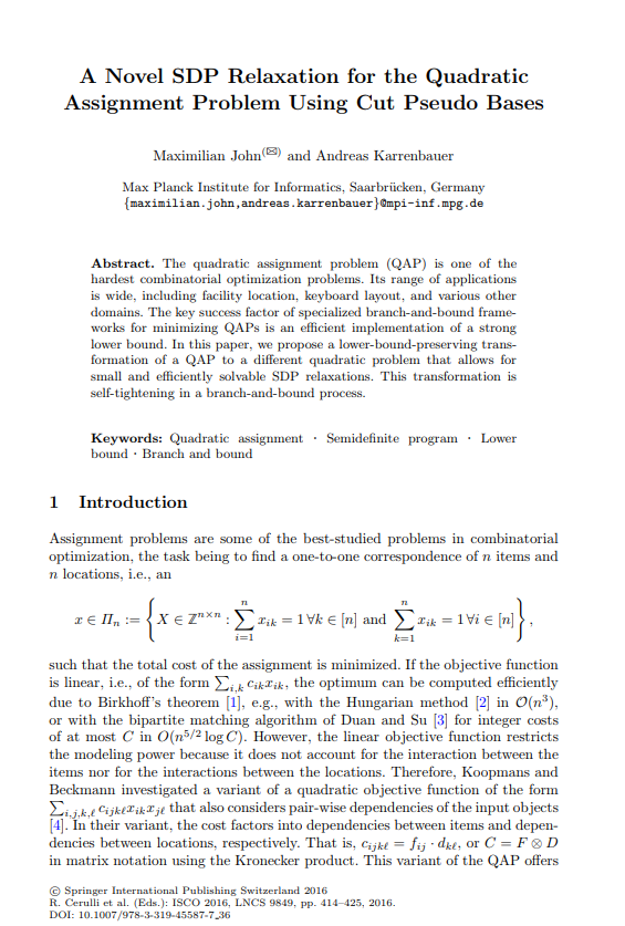
Maximilian John, Andreas Karrenbauer
A Novel SDP Relaxation for the Quadratic Assignment Problem using Cut Pseudo Bases
